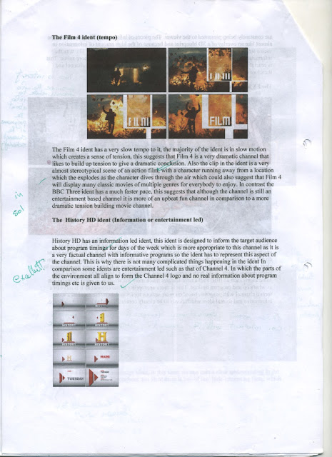
As our brief involved us working alongside the drama academy we put together a proposal to help put across our ideas for the film. Within the proposal we included a brief overview of the locations we thought were best to use which suited the interpretation of Shakespeare we were trying to create. We also included a basic prop list which followed our modern theme for the production. We then presented our ideas alongside our storyboards to the drama academy and discussed the best possible ideas for the final product, we also briefly went over the outline of the first day filming so everybody would know what was required of them on the day so that we could work quickly and efficiently.
Monday, 30 December 2013
Proposal to Drama Academy
As our brief involved us working alongside the drama academy we put together a proposal to help put across our ideas for the film. Within the proposal we included a brief overview of the locations we thought were best to use which suited the interpretation of Shakespeare we were trying to create. We also included a basic prop list which followed our modern theme for the production. We then presented our ideas alongside our storyboards to the drama academy and discussed the best possible ideas for the final product, we also briefly went over the outline of the first day filming so everybody would know what was required of them on the day so that we could work quickly and efficiently.
Thursday, 19 December 2013
Location visit
In our initial planning a key part was the location, this was very significant within the brief as the location played a large factor in determining the feel and atmosphere of the entire film. Due to this we did some research and looked at places within the local area that would fit the requirements of our film, we decided that Morden Park was an ideal location and it had many uses. The park gave us lots of open space for establishing shots but the more confined areas could also be used, the entire area was naturally lit and was easily accessible. There was also a large variation of scenery within the park meaning we could use different areas from within it to our advantage as they look like completely different places within the film which was useful when filming the two scenes at different points in time.
Monday, 11 November 2013
Location Visit Sheet
After we came to a definite agreement with the drama academy on where we were going to film we produced a location visit sheet for Morden Park.We used this opportunity to find any last requirements we might need when filming on location such as extra lighting and also any health and safety aspects we may need to consider when filming on location and also when traveling there.
Saturday, 2 November 2013
Review of Titus Andronicus Play
In preparation for our project our BTEC Media class went to see Titus Andronicus at Stratford upon Avon. Viewing the professionals interpretation of the play and the way certain characters were portrayed and the use of spacing gave us a new perspective on the play. For instance, as a group we felt sorry for Tamora and that she was a very weak vulnerable character. However, they way she was portrayed in the play was actually as a much stronger evil character. Another aspect of the play I thought was creative was the use of multiple time periods such as some soldiers were dressed as traditional Roman soldiers, and Titus' sons were wearing hoodies and riding BMX bikes around the stage. This was useful to us as we have decided to set the film in a more modern time so seeing the play being successfully performed in the different time periods with it still being understandable means that we should be able to replicate this within the film.
The play itself made me consider multiple aspects of our film production due to my role as the main editor, While watching the play I was gaining a greater understanding of who the important characters were in each scene which I would have to represent by the shots used in our production. Another interesting part was the way the play transitioned between each scene in a creative yet fluent way, I knew that I would have to have some attempt at recreating this in the post production of our film to not only maintain the continuity but to also still have creative and interesting transitions between the shots while maintaining the focus on the key characters.
Additionaly, as we have been given a specific segment of the original text which had parts cut out to work from. I will need to make sure there is a smooth progression through the film, allowing the audience to be able to understand what is happening at each part of the film and its relation to the play. It will also be important to create some significant contrast in the segments of the text where the build up to the point is not present, the visual differences will hopefully clarify the change in position within the piece itself to prevent the audience from becoming confused. From reading through the final scripts I have gained a greater understanding of the essential messages specific to each part of the texts which will need to be portrayed equally through the performance of the cast, but also through the cinematography and style of editing accompanied by special effects to emphasise the performance and therefore messages and themes within the piece.
Joint Session
Assessing the joint session with the drama academy
We collaborated with the drama academy to discuss our ideas from both aspects of film and also theater. We first briefly discussed some of our basic concepts and thoughts by presenting our story board, props, costumes and also the location. We received their feedback on what they thought about the individual ideas and they were comfortable with most of them and we built upon some ideas such as the props and costume which we then re-incorporated into our original idea. They then performed what they had worked upon so far from start to finish. As Media students we then briefly discussed amongst ourselves how we can work and integrate with what the drama academy has produced.
We put forward our ideas and they were open to our criticisms, our main concerns were that the piece was heavily theatrical. To overcome this we discussed the spacing and movement of the characters to allow us to work with the shot types, angles and also being able to clearly identify the significant characters in each scene. For example in the first shot which is based upon the return to Rome there is a distinctive separation between the Romans and Goths however they are sitting and unguarded. So we worked on the positioning of some of the characters and mixed some roman guards in with the goths keeping control of them and also have the goths walking along with the Romans.


Another important decision we made was based upon Tamora's speech. The drama academy had produced a piece in which the entire cast spoke the lines with Tamora in the foreground and everybody else behind. From a filming perspective we thought this would confuse the audience and also due to the amount of people talking at once it lacked fluency. We incorporated the idea from our storyboard of Tamora performing the speech directly to Titus with her sons in the background which the drama students improvised and went very well. We are planning to also add some additional Roman guards into the scene to emphasize that the Goths are still prisoners of the Romans and have very little power.


In addition to this change for Tamora's speech we will also add some cut-aways to prevent the clip dragging out too much, but the audio of her speech will remain constant throughout the clips. For the cut aways we decided to keep the clips relevant to the speech and cut between characters expressions depending on who she is talking to/about.
We collaborated with the drama academy to discuss our ideas from both aspects of film and also theater. We first briefly discussed some of our basic concepts and thoughts by presenting our story board, props, costumes and also the location. We received their feedback on what they thought about the individual ideas and they were comfortable with most of them and we built upon some ideas such as the props and costume which we then re-incorporated into our original idea. They then performed what they had worked upon so far from start to finish. As Media students we then briefly discussed amongst ourselves how we can work and integrate with what the drama academy has produced.
We put forward our ideas and they were open to our criticisms, our main concerns were that the piece was heavily theatrical. To overcome this we discussed the spacing and movement of the characters to allow us to work with the shot types, angles and also being able to clearly identify the significant characters in each scene. For example in the first shot which is based upon the return to Rome there is a distinctive separation between the Romans and Goths however they are sitting and unguarded. So we worked on the positioning of some of the characters and mixed some roman guards in with the goths keeping control of them and also have the goths walking along with the Romans.


Another important decision we made was based upon Tamora's speech. The drama academy had produced a piece in which the entire cast spoke the lines with Tamora in the foreground and everybody else behind. From a filming perspective we thought this would confuse the audience and also due to the amount of people talking at once it lacked fluency. We incorporated the idea from our storyboard of Tamora performing the speech directly to Titus with her sons in the background which the drama students improvised and went very well. We are planning to also add some additional Roman guards into the scene to emphasize that the Goths are still prisoners of the Romans and have very little power.


Thursday, 31 October 2013


Monday, 21 October 2013
Information on companies involved
The Royal Shakespeare Company and London Connected Learning Center work together alongside 5 secondary and primary schools in Lambeth on various projects. All the students involved have an opportunity to work with practitioners from the RSC and LCLC to gain a deeper understanding of the plays.


The London Connected Learning Center (LCLC), part of the Education Trust, is an organisation committed to helping schools and students harness the potential of new technologies. From better communication and more effective administration, to improved teaching and learning. We will be working alongside a professional film maker Sam Lawler who has produced multiple documentaries. He will be meeting with us throughout the project assisting our film making ability and teaching us the skills required to produce the piece. Some of the skills we will be learning to use are using boom microphones to record audio on the day of filming, and also assisting us with some camera techniques such as focus pulls. He will also aid us in developing our concepts for the piece and putting forward ideas of how we could produce them, and then putting these ideas forward to the drama academy for discussion so that we can make a compromise for what we want to do within the project.
Thursday, 3 October 2013
Example of a Brief
There are many comissions available for many different careers, within Art there are multiple comissions available ranging from designs, advertising and illustration. One brief I found online stated.
Transported is seeking an artist or designer to create a series of up to 10 artworks that will be reproduced in vinyl wraps on articulated lorry trailers. These designs will be inspired by the people, the landscape or the ‘place’ of Boston Borough and South Holland and will travel around Lincolnshire, The UK and Europe.
The brief is a comission which can be completed by an individual or smaller company, the brief states that 10 designs need to be produced. The dimensions of the lorry's are provided and additional information such as what must be included e.g. the trailers identity number and the company logos must also be taken into consideration for the designs. The themes of the designs must represent the culture, landscape or community of the area and must be of a high quality and standard.
Once the artist(s) have been selected for the comission they must follow the guidelines however the brief is felxible to the extent that the artist is able to create what they feel like best fits the brief.
http://www.publicartonline.org.uk/downloads/news/Haulage-Carrier-Commission-Brief-2014.pdf
Monday, 30 September 2013
Sunday, 29 September 2013
Titus Andronicus Research
Titus Andronicus is one of Shakespeare's most violent plays, set in the roman era the play is based on the return of Titus a general in the Roman army, who continues on a path of revenge against Tamora, Queen of the goths.
Brief Synopsis
The brothers Saturninus and Bassianus are in contention for the Roman emperorship.
Titus Andronicus, Rome's most honoured general, returns from wars against the Goths with their queen, Tamora, her sons and her lover, Aaron the Moor, as captives. Her eldest son is sacrificed by Titus; she vows revenge.
Titus is nominated emperor by his brother Marcus, one of Rome's tribunes. This Titus declines, instead nominating Saturninus.
To seal the bond of friendship, the new emperor, Saturnius, offers to marry Titus's daughter Lavinia. She, however, is already pledged to Bassianus.
Saturninus, by now infatuated with Tamora, makes her empress instead.
Manipulated by Aaron, Tamora's sons, Chiron and Demetrius, avenge their mother by raping and mutilating Lavinia, and killing Bassianus. Aaron falsely implicates two of Titus's sons in this murder.
In his turn Titus vows revenge and sends his surviving son Lucius to the Goths to raise an army. Titus achieves his revenge by killing Tamora's sons and serving them up to her at a banquet, and then killing her.
He himself is killed by Saturninus and his death avenged by Lucius, who is made emperor.
The main characteristics of the play include:
- Violence - 10 named characters die within the play, and 21 of Titus' sons die before it even begins.
- The play is very gruesome - the way in which the characters within the play were disturbingly killed and then the acts carried out with their bodies are very gruesome.
- The play is fictional - The play takes place in a recreation of what was believe to be 16th century Rome.
- A tale of revenge - The majority of murders and violent acts are all in response to a previous murder, the story is focused on a cycle of revenge between Titus and Tamora.
- Vast and confusing - There are a large amount of characters and the relations between them which link the murders and revenge can be confusing due to the vast scale of everything happening.
This segment from the film is the part of the play we will be focusing on. What this scene briefly shows is upon Titus' return he gains revenge upon the death of his 21 sons and he does this by sacrificing the oldest son of Tamora who he has prisoner. As this is about to happen Tamora pleads to Titus and begs him to not harm his son but he does not listen.
Tamora:
Stay, Roman brethren! Gracious conqueror,
Victorious Titus, rue the tears I shed,
A mother's tears in passion for her son:
And if thy sons were ever dear to thee,
O, think my son to be as dear to me! 125
Sufficeth not that we are brought to Rome,
To beautify thy triumphs and return,
Captive to thee and to thy Roman yoke,
But must my sons be slaughter'd in the streets,
For valiant doings in their country's cause? 130
O, if to fight for king and commonweal
Were piety in thine, it is in these.
Andronicus, stain not thy tomb with blood:
Wilt thou draw near the nature of the gods?
Draw near them then in being merciful: 135
Sweet mercy is nobility's true badge:
Thrice noble Titus, spare my first-born son.
Monday, 22 July 2013
Thursday, 11 July 2013
Updated Ident
This is my improved ident.
In this improved ident I drew the frames for the shots and made sure they were consistent with the themes of the channel such as music, talk shows and sit-coms, I then took images of all the individual frames and put them into a sequence, as the images were black and white I added some colour overlays in time with the beat to create a more colourful and vibrant edit to relate to the target audience more effectively. The song I used was a modern remix of an older song, this shows how the channel can bring life and excitement back into older things. Finally I chose a simple bold font to show the title 'The Grid' this works well as it's simple and gets to the point meaning its easier for the audience to take in and remember.
Thursday, 20 June 2013
Ident Decisions
Ident Decisions
During the production of my ident I realised that it is difficult to animate the shape of the paper during the transitions from one form to another, to overcome this I had to simplify the animation and remove some of the transformations and then attempt to re-create them in the editing process. Because of this the final ident differs from the original plans in many ways. I found that some of the other aspects of my ident were not practical and very difficult to replicate in real life. Because of this I used my additional feedback from after the ident was produced to make changes to the plans and to re-produce an improved ident.
I maintained the concept of using paper and stop-motion to produce the animation, however due to the difficulties I experienced in my previous ident I decided to create an ident based on the theme of flip books, this allows the movement of the paper to be simplified making the photography easier, also the themes and concepts of the channel can be more clearly portrayed through the drawings on the paper itself.
Monday, 10 June 2013


Sunday, 9 June 2013


Monday, 3 June 2013
Improved file format help sheet
File Format help sheet.
JPEG: Joint Photographic Experts Group
JPEGs are the most common image format used and due to this they have many applications, ranging from the formatting of most digital cameras to images uploaded on the internet. One of the most useful features of a JPEG image is that the compression of the image can be altered therefore the quality of the image can subsequently do so. JPEG's have a lossy compression rate, which means some quality is
lost however as you start to edit and zoom into the image artifacts are created. An example of this can be seen on the images below, the image on the right hand side has lost large amounts of data due to compression and therefore has become very pixelated and unclear. This occurs due to the format recognising areas of similar
colours and then making whole areas follow the pattern of that colour, creating
large pixelated areas of one colour.
One other benefit of JPEGs is that they can be
interlaced, meaning the image can be progressively downloaded if you have a
slow connection allowing you to see a preview of the image before it fully
loads, however one disadvantage to interlaced JPEGs is that it has a lossy
compression rate and the format does not support animation.

PNG: (Portable Network Image)
PNG's were developed to transfer images over the Internet,
they can be created with or without an alpha channel (transparent background)
and support lossless data compression meaning very little data is lost allowing the image to generally maintain its quality. Below you can see a comparison between the JPEG and PNG formats, as the PNG can undergo lossless compression it is better at displaying high contrast bold lines and solid colours than the JPEG which will produce artefacts which is why the text looks clearer and more defined in the PNG image. However, due to the compression for most high detail photographic images with more colours and details the PNG will produce a much large file with no signifcant change in quality which is why the JPEG is prefered for photography. The
concept of the PNG file was first thought of in 1995 as a replacement for the
GIF however the format does not support animations. The file format itself was
developed in 1996. The format is widely supported and commonly used in images
especially online as it allows for very crisp details in text and visual graphics displayed on webpages.

GIF: (Graphics Interchange Format)
GIF's were developed in 1987 as a bitmap image
format, the format holds up to 256 colours, which in comparison to more modern
formats isn’t many however unlike most formats GIF's also support animations which can be seen below with the image of the earth rotating.
The main frame of the GIF acts as the thumbnail image, and then the additional
frames come in to form the animation, the frame rates can be adjusted however
the more frames the larger the size will be. The GIF has a lossless data compression meaning data is not lost and file size is reduced, however due to
the limited colours GIF's cannot be used to show high quality images.
.gif)
PSD: (Photoshop Document)
PSD is an image format that is very useful,
this is because unlike most formats it can store additional information about
the image such as the layers and effects that were used to create the image
within Photoshop which is very useful. However, because the extra information is stored within the file the file sized is usually considerably large than the same image being held within an alternative format, meaning that sharing the PSD file across a slower bandwith may take a long time. Also, because Photoshop is widely used, the PSD format can be
accessed through other forms of software from Adobe. One disadvantage to the
PSD format is that it has a limit on dimensions and also files size, from 30000
pixels to 2GB. However, one solution to this is a larger version of the PSD format,
which allows an extended file size, and larger dimensions. Another significant issue with this format is that it is difficult to view unless you have specified software to view the image as most standard programs do not allow the PSD to be viewed.
RAW
RAW image formats are the original files containing
data directly from the camera, there is no processing or compression in-between to convert
the RAW image into a standard file format such as a JPEG. Because of this the
Raw files contain all of the original information and are of a higher quality
than other file formats. Raw files can not always be used directly and are sometimes difficult to view due to most camera models producing their own RAW format to hold the image in. However, once the image is accessable an individual has much greater control over the image which is why they are a prefered format for photographers who can then fully adjust the image afterwards. Another disadvantage of the RAW format is that because it stores all of the orginal data from the camera with no compression the file size is considerably larger than most standard file formats such as the JPEG used in photography. In the images below you can see the JPEG image has higher contrast and is also brighter due to the processing that occured in the camera to produce the image. Initially the RAW photo does look worse than the JPEG as it will need to be manually adjusted to create the correct contrast, brightness and colour balance but this gives the photographer greater control over their work.

Exif: (Exchangeable Image File Format)
Exif was developed by the Japan Electronic
Industries Development Association in 1998, and is used to store metadata
within the original file format. This data can include the date, time and even
model of the camera, this is useful as it allows users to be able to access
information about an image that is otherwise not available in other
formats.
Tiff: (Tagged Image File Format)
Tiff was developed as a standard format for
scanners in the 1980’s, the original version could only handle two set values for
each pixel being black or white, but as scanners developed so did the format
meaning that today the TIFF format can support black and white, greyscale and a high range of colours with very high detail. The format is widely supported due to it being a successful way to
store image data, however one main disadvantage to the format is that there is
a file size limit of 4GB which may prevent some necessary larger files from being produced.

PDF: (Portable document Format)
PDF was developed in the 1990’s as a way of
sharing documents between different devices that may use different softwares
and operating systems etc. The PDF contains the document, text, fonts, sizes
and all additional information needed to display the image. One disadvantage of
the PDF especially in the past is that due to the large file size the document
did take a long time to download on slow connections and on slower systems the
document did take a while to open and render. An advantage is that you can open
PDF's in the web browser as well as on different systems and versions of
software.
PCX:(Personal Computer Exchange)
PCX was one of the first file formats to be
used as an imaging standard, however it has been overtaken by more advanced
formats such as JPEG and PNG. The format can hold a variety in the number
of colours ranging from 16 to 16.7 million which also means there is a large
variation in the quality. The format also works with a simple lossless
compression rate; meaning very little data is lost when compressing the image to maintain a higher quality with reduced file size.
WebP
WebP is a new file format being developed by
Google, it was first announced in 2010 to be a replacement for most image
formats such as the JEPG and PNG due to its matching image quality with a
significant reduced file size for the image. This is very useful to modern
standards as more images are shared on the web, meaning an image with a reduced
file size and matching image quality web pages will be able to load much faster
and the images can be transferred at a much higher rate even across slower bandwiths. The file supports a
lossless compression format and is also being developed to support animation,
just like GIF's making it a potential future standard for all images in the future. Below you can see there is negligible difference between the WebP and JPEG images, yet the WebP has a reduced file size which is very beneficial.


Wednesday, 15 May 2013

Monday, 13 May 2013
Final Logos
Final Logos

Lock
This is my logo for the station Lock, from the name of the station I decided to give the logo a hardcore rock theme, I did this by using a dark brown colour scheme with lots of contrast and movement within the image. This creates a sense of energy and relates to the rock theme. I also incorporated an image of a lock into the text, this emphasizes the station's name and makes it more distinctive.
The target audience is also portrayed through the logo as the images and overall style of the logo suggests that the station is aimed at a slightly older target audience ranging from late teens to 40 year olds, also as the logo comes across as darker and dirty the logo may be interpreted to be aimed slightly more at a male audience.
I printed out the logo and received some feedback on it from other media students, "the tint and colour scheme works well and the lock and chain images suit the channel well, however the logo is missing the 'OWMusic' logo in the top compared to the others".
To improve this logo I would use some darker bold black shapes to create a jagged edge to the logo similar to a smashed window, I would also reduce the width of the logo and add the 'OWMusic' logo to the top so it fits with the other logos.

Pulse
This is my logo for the station Pulse, from the name of the station I decided to give this logo a more modern theme, I did this by using a wider variation in vibrant colours as well as keeping a black and white theme to give the logo a cleaner futuristic look. The negative halves of the logo show the contrast within the station, which relates to the different types of music that they will play.
The font and images work well together as they are consistent with the theme of a pulse and the mixture in colour and the feel of the logo would attract a target audience of both males and females from their mid-teens to late-twenties. This is effective as that age bracket are the ones who are most likely to enjoy the genres of music being played by the station.
I printed out the logo and received some feedback. "The colours around the side work well, the split sided skull looks good and works well with the headphones and it clearly represents the channel brand".
To improve this logo I would use a higher resolution image of the skull and also neaten up the bottom half of the image with the coloured flames around the neck to make the logo look more professional.

VIP
This is my logo for the station VIP, from the name of the station I decided that it was modern yet professional and sophisticated. Because of this I used a dominantly black and white colour scheme and kept the logo relatively simple. Within the logo I used images that related the station to a nightclub, I then added some colourful waves and an RGB split to give the logo some vibrance.
The concept behind this logo was inspired by night-clubs so through the use of energetic images and bright vibrant colours the logo attracts a target audience of around 18-30 which is effective as they are the age of people who would enjoy to go out clubbing and listen to the types of music provided by the station.
I printed out the logo and received some feedback, "looks to a professional standard, the colours work well together along side the font. However, the fire in the background looks odd".
To improve on this logo I would remove the fire as it was suggested in my feedback, I would also reduce the height of the logo to remove the unnecessary empty spaces.
Comparisons to professional work
After looking at other professional pieces of work such as the family of
logos for BBC Radio, I have noticed that the professional logos are much more
simplified and bolder than my logos. This makes them much bolder and
distinctive and clearer to look at making them more successful. Also, due to
their simplicity they only contain around two colours, this gives them a higher contrast and allows them to easily portray a distinctive message about the
type of radio station without being over-complicated.

VIP Logo progression
VIP Logo progression
I decided that VIP was quite a stylish yet energetic and upbeat radio station, so I decided to keep the image and the colour scheme relatively simple. I used a bold clean font to clearly display the name of the radio station and created a crowd of people using silhouette images.
 From the original logo above, I made the background darker and added some colour to different areas of the image but still maintaining the black and white throughout most of the image. I also added some flames to the background of the image to make the radio station seem more energetic.
 This is the final image, the end result was effective due to it clearly portraying the type of radio station through the use of colors as well as the font an background images. The format used to save the image was a JPEG due to the high compatibility, this allows the image to be diversely used in a mixture of forms such as posters and letterheads for websites.
I decided that VIP was quite a stylish yet energetic and upbeat radio station, so I decided to keep the image and the colour scheme relatively simple. I used a bold clean font to clearly display the name of the radio station and created a crowd of people using silhouette images.


Lock Logo progression
Lock Logo progression
 From the name of this channel decided to give the logo quite a hardcore rock theme, I did this by using a bold eroded text and dark colours, I then incorporated an image of a padlock wh I then decided to take this theme further and gave the logo a sepia tint along with a grainy texture so the image looks damaged and eroded.
 This is the final logo, this logo worked well as the bold images and use of colours create a very strong message about the radio station and the type of music that will be played. This image was created as a JPEG which is commonly used, this mean that the logo can be used in a variety of ways, due to the aspect ratio of the logo being wide the logo is more suited to billboards and letterheads however it would also work in a poster format.


Subscribe to:
Comments (Atom)